Last updated on 2019-10-30
Previous lesson: Learning C3.js – Lesson 2 – Chart Types.
In the previous lesson I went broad showing all types of charts. Now it’s time to go deep into each type of chart (or at least the interesting ones). Let’s start with line charts. In the following lessons I will include only the javascript code that creates the chart and assume there is an HTML page with a div container that has id="chart" to display the chart.
Line charts display a series of sequential data points, and it’s usually used to visualize trends in data over the sequence (which is many times a point in time). For the sake of completeness, here’s how a basic line chart is generated using C3:
var chart = c3.generate({
    bindto: '#chart',
    data: {
        columns: [ ['data1', 50, 20, 10, 40, 15, 25] ],
        type: 'line'
    },
});
And this is the result:

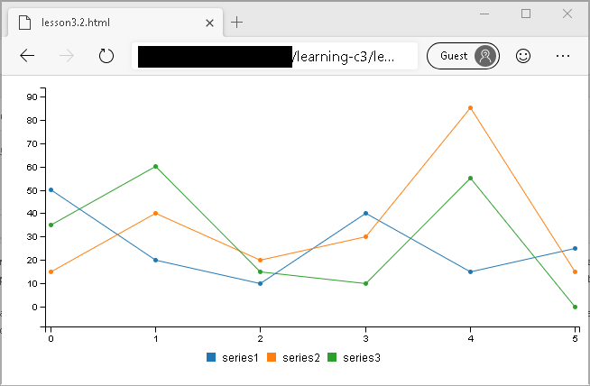
More series can be added to the chart by adding more entries to the array that is passed as column. Each entry will create a new series in the chart, as follows:
var chart = c3.generate({
    bindto: '#chart',
    data: {
        columns: [
            ['series1', 50, 20, 10, 40, 15, 25],
            ['series2', 15, 40, 20, 30, 85, 15],
            ['series3', 35, 60, 15, 10, 55, 0],
        ],
        type: 'line'
    },
});
And this is the result:
A typical use for line charts is time series charts, where the x axes it a time/date/datetime range and each element in the series occurs at a specific point in time. C3 supports this by passing an axis parameter to the generate function that sets the x axis to be a timeseries, and an additional column that defines where each of the points in the time series occur:
var chart = c3.generate({
    bindto: '#chart',
    data: {
        x: 'x',
        columns: [
            ['x', '2013-01-08', '2013-01-02', '2013-01-01', '2013-01-04', '2013-01-03', '2013-01-06'],
            ['data1', 30, 200, 100, 400, 150, 250],
            ['data2', 130, 340, 200, 500, 250, 350]
        ]
    },
    axis: {
        x: {
            type: 'timeseries',
            tick: {
                format: '%Y-%m-%d'
            }
        }
    }
});
And this is the result. Notice that the elements in the series are not in order (on purpose) yet they are displayed correctly. Furthermore, the horizontal space between the elements is also correct relative to their dates:

But some things are not “right” here. First, the first and last points are very close to the start and end of the graph and the last axis ticker even falls off the div which doesn’t look good. There is also a difference in the space between the first 3 tick marks and the last 3. Can we fix this? While certainly! Let’s do a couple of things to improve this chart: we’ll add both vertical and horizontal gridlines, we’ll add labels to both axes, some padding on the right so the label doesn’t cut, and show continuous tick points. To make the sample even more interesting, I’ve changed the way the input data is read using a custom format. Here’s the code:
var chart = c3.generate({
    bindto: '#chart',
    padding: {
        right: 20,
    },
    data: {
        xs: {
            data1: 'x1',
            data2: 'x2'
        },
        xFormat: '%Y%m%d',
        columns: [
            ['x1', '20130108', '20130103', '20130101', '20130104', '20130107', '20130105'],
            ['x2', '20130108', '20130102', '20130101', '20130104', '20130103', '20130105'],
            ['data1', 200, 200, 100, 400, 150, 450],
            ['data2', 130, 340, 200, 500, 250, 350]
        ]
    },
    axis: {
        x: {
            type: 'timeseries',
            tick: {
                format: '%Y-%m-%d',
                fit: false,
            },
            label: {
                text: 'Date',
                position: 'outer-center',
            },
            min: '20130101',
        },
        y: {
            label: {
                text: 'Price',
                position: 'outer-middle'
            }
        }
    },
    grid: {
        x: {
            show: true
        },
        y: {
            show: true
        }
    }
});
And this is the final result, which I think looks great :-):

I think this is enough for now. As always, you can find the code for this lesson (and all other lessons) in my GitHub repository. In the next lesson, I’ll be digging into bar charts deep and wide. Until then, happy coding!
Next lesson: Learning C3.js – Lesson 4 – Bar Charts.
Love your work! <3 Thank you so much. The official documentation should link to your site on this series.